Building an effective landing page is surprisingly hard, but there are tried and tested methods. Here’s how I did it while building a new product called Markfolder, a tool for bookmarking tweets.
I’ll start with what I learned, and then details after if you want to read further.
Learnings
- Create a landing page BEFORE building your product, because…
- It really helps you refine many aspects of your idea.
- Creating a landing page can take a long time. It took me about 5 days in total.
- Skills required: copywriting, UX, design. You can learn these “on the job”.
- Use a tried and tested template and don’t reinvent the wheel.
- Use no-code tools to build it quickly, e.g. Webflow.
- Ask for feedback. Lots of people want to help you. Make use also of maker-focused forums like IndieHackers.
How I did it
As recommended in the book Traction by Weinberg and Mares, I’m dedicating half of my time to building the product and half to getting people to sign up (i.e. traction). So far this has been a great exercise because working on traction early also means early validation of my customer segment and the problem I’m trying to solve.
In order to start acquiring traffic, I first needed a website for traffic to land on. So the primary task here was to create a landing page. This is a project in itself.
Template
I used a guide by Julian Shapiro for creating landing pages. This saved me a lot of research because he outlined the template, thought process and feedback questions all in one post.
Building it
For the actual code, I had a HTML template I had bought a while back, so I just repurposed that for the landing page. I hosted it on my existing hosting service provider, which I’m using for other websites. Another option would have been to use a hosted solution like Webflow.com. I did start of looking into Carrd.co but found it too limiting for my needs.
The main images were created from screen grabs of Twitter, and then modified in Photoshop to make it look like Markfolder’s UI. Additional imagery were created using icons from Flaticon.com and put together in Figma.com.
For the signup form, I just used a free version of Airtable.com. With Airtable I was able to create a database for signups and embed a form for that database into my website. No backend coding required.
Social proof
One of the sections we are supposed to include in the landing page template is a section on social proof. Unfortunately, since Markfolder is still under development, social proof on the product is zero!
I’ve left out the social proof section for now. However, I hope that the early users of Markfolder, the Innovators and Early Adopters, will need little social proof to try it out.
Feedback
Once I had all the elements in place, I published the landing page and sought feedback from people I know as well as from some of the forums I’m a member of.
The question I asked them were taken from Julian Shapiro’s guide. They are well thought out questions and the answers were really useful. The questions are:
1. Are you willing to sign up right now? If not, what would you need to see to get to that point?
2. How well the page sustained your interest on a scale of 1–10. What do you suggest be rewritten or redesigned to help it better sustain your interest?
3. What’s unclear? What unanswered questions are you left with?
4. Did you find something really interesting you wanted even more details on?
5. If you had to delete half the page’s imagery and copy, which would it be?
6. What triggered your “Untrue! That’s scammy sales speak!” reflex?
In total I received 6 detailed feedback. The most common feedback was that it wasn’t clear what benefit Markfolder provided the user. I didn’t realise it but in the landing page I wrote about features and not the pain or benefit.
The landing page also had imagery that didn’t make sense — it was trying to be “clever” and created some conceptual images to explain the features, which obviously backfired!
Signups!
As a side effect, I also received 2 signups from posting the landing page asking for feedback. This really help boost my confidence that I’m on to something.
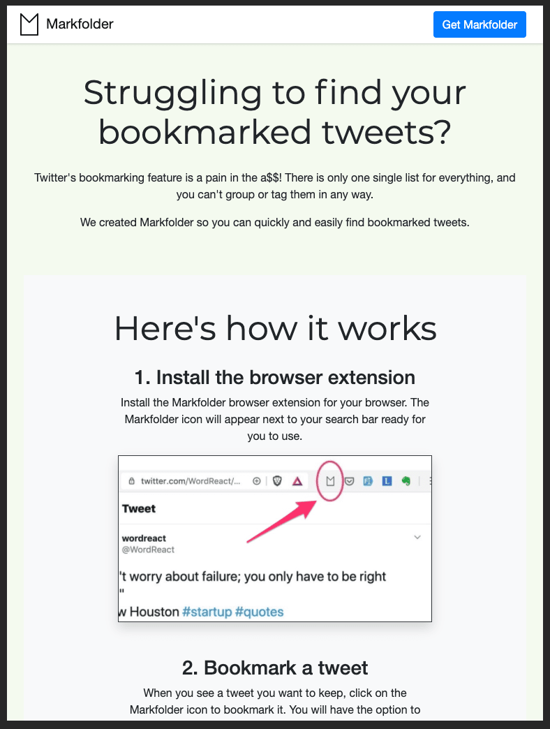
The landing page
Here’s what the live landing page, https://markfolder.com, looks like…
Next steps
There’s always room for improvement, but it’s just as important to ship, so this is now live. I’ll make tweaks along the way if I see the benefit.
The next step is to get some traffic to it! I will detail my approaches to this in the next post.
Acknowledgements
Thanks to these great minds for feedback on the landing page and for helping make it better: Ram Nair, Rachel How, Austen Cameron, Nathan Rodgers, Frontendor, and orliesaurus. So sick 🤙🏽.
If you think this post is useful, please do share by forwarding this email to your friends.
Subscribe to posts by email at https://farez.substack.com.
You can also follow me on Twitter @farez where I post on my startup progress.